The Original Design Was Pure Calligraphy
The Coca-Cola logo dates back to the late 1800s, when it was created by Frank Mason Robinson, a bookkeeper for the company’s founder, John Pemberton.
At the time, branding was not about hidden meanings or psychological tricks. It was about elegance, clarity, and distinction.
Robinson used Spencerian script, a popular handwriting style known for its decorative, flowing letterforms.
There is no historical evidence that any hidden smile or subliminal message was intentionally built into the design. The goal was simple: make the name look refined and memorable.
Why Our Brain Sees a Smile Anyway
Even though the smile wasn’t designed on purpose, many people still see it—and psychology explains why.
This is due to a natural cognitive pattern called pareidolia, where the human brain interprets familiar shapes, especially faces, in abstract or random visuals.
It’s the same reason people see faces in clouds, patterns in shadows, or shapes in landscapes.
Our brains are wired to recognize expressions quickly because reading emotion has always been essential for human survival.
So when we look at curved, flowing typography, the mind often completes the pattern into something familiar—like a smile.
Branding That Reinforces the Illusion
There’s another reason this perception feels so strong.
For decades, Coca-Cola has built its identity around happiness, joy, and connection. From festive holiday campaigns to global slogans about sharing and togetherness, the brand has consistently associated itself with positive emotion.
Because of that, people don’t just see a logo—they see a feeling.
So when the brain looks for emotional meaning in the design, it naturally leans toward something positive, like a smile.
Coincidence or Genius Design?
Whether the “hidden smile” was intentional or not, its impact is real.
Even accidental design features can become powerful when they align with how people think and feel.
In this case, a 19th-century handwriting style combined with modern perception has created a viral moment that feels almost magical.
It’s a reminder that meaning isn’t always placed into design—it can also be discovered by the audience.
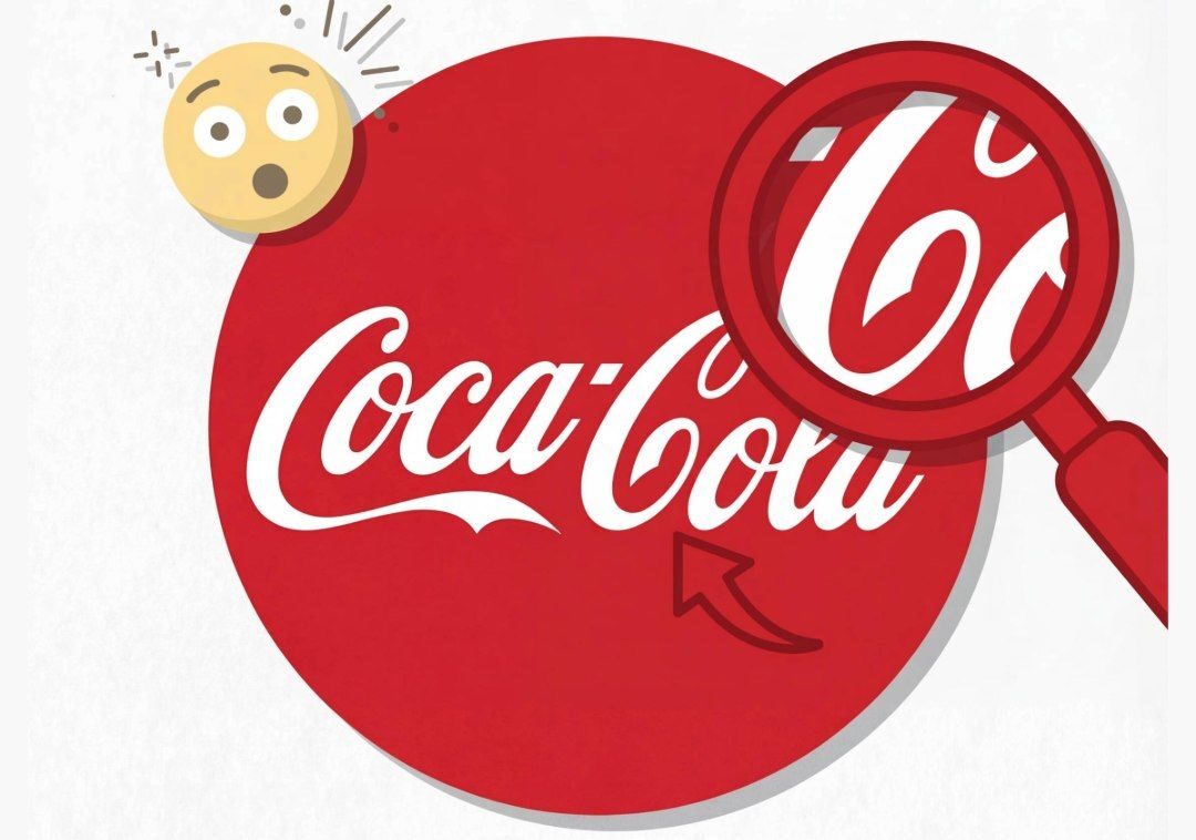
Why This Detail Captures So Much Attention
Part of the fascination comes from discovery itself.
In a fast-paced digital world, people love finding hidden layers in familiar things. It creates a sense of surprise, almost like uncovering a secret that has been there all along.
The Coca-Cola “smile” turns an everyday object into something personal, playful, and interactive.
Even if it’s just perception, the experience feels real.
Final Thought
Whether intentional or imagined, the idea of a hidden smile inside one of the world’s most iconic logos shows how powerful perception can be.
Sometimes we don’t just look at design—we complete it with our own minds.
And that may be the most interesting part of all.
If this surprised you, share your thoughts below and join the conversation—what other everyday logos might be hiding details we’ve never noticed?