Early versions of the branding were simpler, but as recognition grew, the logo became central to how the brand communicated itself. Instead of frequent radical redesigns, the company chose gradual refinement—preserving familiarity while improving clarity and modern appeal.
This careful evolution helped maintain consistency, which is essential in branding. When people repeatedly see a familiar symbol over time, it builds trust and strengthens recognition.
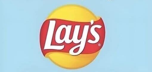
The Power of the Yellow Circle
One of the most defining elements of the logo is the bold yellow circle. This background isn’t just decorative—it plays a major role in shaping perception.
The color yellow is widely associated with warmth, happiness, and energy. In the context of Lay’s, it also subtly reflects the golden color of potato chips, creating a natural visual connection between the logo and the product.
The circular shape adds another layer of meaning. Circles often represent comfort, unity, and completeness, which helps make the design feel soft, inviting, and easy on the eyes.
Together, the color and shape create a strong visual anchor that is both simple and highly effective.
The Red Ribbon That Brings It to Life
Cutting through the yellow circle is the signature red ribbon, one of the most distinctive features of the logo.
Red is a powerful color in design—it naturally draws attention. But in this case, the curved ribbon softens its intensity, creating a sense of movement rather than aggression.
This flowing shape adds depth and energy to the logo, preventing it from feeling flat or static. It guides the viewer’s eye and makes the entire design feel more dynamic and engaging.
At the same time, it reinforces the idea of ease and enjoyment, aligning perfectly with the brand’s identity as a casual, feel-good snack.
Typography That Feels Approachable
The lettering in the Lay’s logo is just as important as its colors and shapes. The font is rounded, slightly playful, and highly readable, which helps it connect with a wide audience.
The white text stands out clearly against the warm background, ensuring visibility across different formats and sizes. This clarity is essential for a global brand that appears in countless environments.
More importantly, the typography reinforces the brand’s personality. It feels relaxed and friendly, matching the overall tone of enjoyment and simplicity that defines the product.
Why the Logo Still Works Today
The lasting success of the Lay’s logo comes down to one key idea: balance. It blends simplicity with emotion, familiarity with freshness, and clarity with warmth.
Instead of constantly reinventing itself, the brand has carefully refined its identity over time. This approach has allowed the logo to remain relevant across generations while maintaining strong recognition.
It also works across cultures and languages because it communicates visually rather than verbally. Color, shape, and composition do most of the storytelling, making it universally understandable.
Final Thoughts
The Lay’s logo is a strong example of how thoughtful design can go beyond aesthetics. It reflects emotion, memory, and everyday experience—all within a simple visual structure.
Its continued success shows that great branding doesn’t need to be complicated. It just needs to be consistent, meaningful, and human.
What do you think makes a logo truly unforgettable? Share your thoughts and explore more insights into iconic brand designs with us.